Your watch can record an extraordinary amount of information during a tennis match. The difficult part is knowing which numbers deserve your attention — and which ones only look precise.
You finish a difficult tennis match and look at your watch.
Average heart rate: 147.
Maximum heart rate: 181.
Time in “Zone 4”: 26 minutes.
Calories: 876.
Recovery heart rate: another number.
Training load: another.
Perhaps your watch also tells you whether the session was productive, strenuous, aerobic, anaerobic or somewhere between them.
The screen looks scientific.
That can make the conclusions feel scientific too.
But those are two different things.
A smartwatch can be extremely useful for understanding your tennis if you treat it as a measurement tool rather than an automatic explanation machine.
The most useful questions are usually not:
“Was 147 bpm good?”
or:
“Did I burn 876 calories?”
They are:
“How did this match compare with other matches for me?”
“Did the physical demand change when the tennis changed?”
“Is this pattern repeated often enough to mean something?”
That is where wearable data becomes interesting.
1. Start with what the watch is actually measuring
Different smartwatch metrics do not have the same status.
Heart rate is, at least conceptually, a direct physiological quantity: the number of heart beats per minute.
Your watch does not usually measure those beats with an ECG.
Most consumer wrist devices estimate heart rate optically using changes in reflected light as blood volume changes beneath the skin.
From that measurement — together with other sensors and information about you — the device may then calculate or estimate things such as:
- heart-rate zones,
- energy expenditure,
- training load,
- recovery,
- aerobic fitness,
- stress,
- readiness.
That distinction matters.
Measured signal and derived estimate are not the same thing.
The farther you move from the original sensor signal, the more assumptions may be involved.
2. Wrist heart rate is useful, but it is not perfect
Consumer wearables can measure heart rate surprisingly well in many situations.
But accuracy depends on the device, the activity and the conditions.
Research comparing wrist-worn devices with ECG or chest-strap reference measurements has generally found heart-rate measurement more reliable than some other wearable outputs, while also finding meaningful differences across activities and devices.
That matters for tennis because tennis is not a steady treadmill run.
You:
- accelerate,
- stop,
- change direction,
- grip the racket,
- swing the wrist and arm rapidly,
- rest between points,
- then suddenly work again.
So do not treat every individual wrist reading as laboratory truth.
A single strange spike may be measurement noise.
A repeated pattern across many matches is much more interesting.
3. Trends are more useful than individual beats
Imagine your watch briefly records 192 bpm during one rally.
What does that mean?
Possibilities include:
- your heart rate genuinely reached that level,
- the sensor temporarily read poorly,
- the watch moved,
- contact with the skin changed,
- the reading lagged behind the activity.
Without additional evidence, one isolated value tells you little.
Now imagine that across ten long singles matches, heart rate repeatedly rises into the same general range during extended physical periods.
That is different.
The useful wearable question is often:
“Is this pattern stable enough to appear again?”
not:
“What does this exact number prove?”
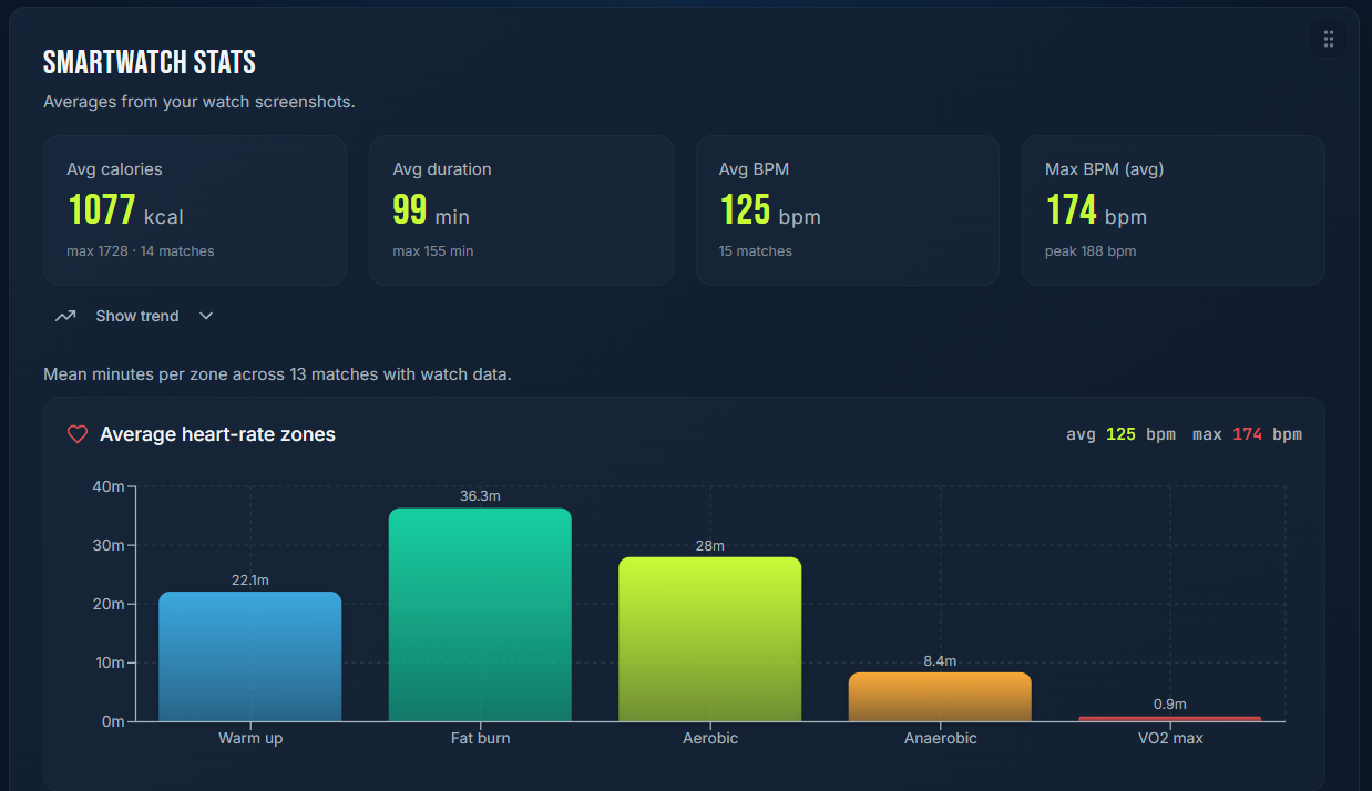
4. Heart-rate zones are categories, not laws of nature
Many watches divide heart rate into zones.
The names and boundaries vary by device.
Often they are based on an estimated or configured maximum heart rate and sometimes other personal information.
This can be useful because zones convert hundreds of individual readings into a simpler picture of how your heart rate was distributed during the session.
But do not confuse the category with the physiology itself.
If your watch says you spent 31 minutes in “Zone 4,” it means:
according to this device's zone definition and the heart-rate data it recorded, 31 minutes fell inside that range.
It does not automatically mean:
I spent exactly 31 minutes at one universally defined physiological intensity.
The zone is a tool for organising data.
5. Your maximum heart rate setting matters
Suppose two players both record 165 bpm.
For one player, the watch may classify it as a very high zone.
For another, it may not.
Why?
Because heart-rate zones are relative to whatever reference the system is using.
If the device's estimate of your maximum heart rate is inappropriate for you, the zone distribution may also become misleading.
This is another reason to be cautious about comparing:
my Zone 4
with:
your Zone 4.
The underlying definitions may not be equivalent.
6. Compare your matches with your matches
This is where smartwatch data becomes much more powerful.
Suppose over several comparable singles matches you notice:
- similar duration,
- similar opponent level,
- similar conditions,
- but one match produces a substantially different heart-rate pattern.
Now there is a question worth investigating.
What changed?
Perhaps:
- rallies were longer,
- there were more demanding defensive points,
- conditions were hotter,
- you were physically less fresh,
- there were fewer pauses,
- the opponent made you move more,
- your own playing style changed.
Heart rate cannot tell you which explanation is correct.
But it can tell you:
this match was physiologically different from the others in some way worth investigating.
7. Average heart rate can hide the nature of tennis
Two matches can have the same average heart rate and feel completely different.
Imagine Match A:
heart rate remains fairly steady for most of the session.
Match B:
heart rate repeatedly rises during demanding rallies and falls between them.
The averages may be similar.
The patterns are not.
This is particularly relevant to tennis because the sport contains repeated cycles of effort and recovery rather than one uninterrupted workload.
If your device gives you a timeline rather than only an average, the shape of the session may be more informative than the headline number.
8. Maximum heart rate is not a performance score
A higher maximum heart rate does not mean you played harder, competed better or became fitter.
Nor does a lower maximum necessarily mean the opposite.
Maximum values depend on many things, including:
- the demands of the match,
- how long demanding periods lasted,
- conditions,
- individual physiology,
- measurement quality.
If you win comfortably while controlling points, the match may simply demand less physically.
If you spend two hours defending against a stronger opponent, the physical demand may be much greater even though the tennis result is worse.
The cardiovascular number and the tennis-quality number are not the same thing.
9. Lower heart rate does not automatically mean “better fitness”
This is one of the easiest wearable stories to invent.
You play Match A at an average of 150 bpm.
A month later, you play Match B at 143.
Conclusion:
I became fitter.
Maybe.
But were the matches actually comparable?
Did they last the same time?
Was the temperature similar?
Did the opponent move you the same way?
Were rallies similar?
Did you play at the same intensity?
Was the measurement equally reliable?
Fitness could be part of the explanation.
The watch alone cannot establish it.
A repeated pattern under reasonably comparable conditions is stronger evidence than a before-and-after pair.
10. Recovery heart rate is not a one-number conditioning test
How heart rate changes after effort can contain useful information.
But interpreting it depends on the nature of the effort, timing, measurement method, individual physiology and other conditions.
A consumer watch should not turn one post-rally reading into:
“Your conditioning is poor.”
If you are interested in recovery trends, compare consistently measured sessions over time.
And keep the conclusion modest:
“This appears different from my usual pattern.”
That is useful.
11. Calories deserve even more caution
Calorie numbers are seductive because they look concrete.
842 kcal.
That looks much more informative than:
“This was a demanding match.”
But energy expenditure from consumer wearables is not measured as directly as heart rate.
It is estimated through proprietary algorithms using combinations of heart rate, movement and personal information.
Across systematic reviews and validation research, energy-expenditure estimates from wrist-worn devices have generally been substantially less accurate than heart-rate measurement.
This does not make the calorie display worthless.
It changes how you should use it.
Do not treat:
842 kcal
as if a laboratory measured exactly 842.
If the same device and settings repeatedly estimate one type of match as substantially more demanding than another, the trend may still provide context.
12. Do not eat according to an exact watch calorie number
This follows from the previous point.
If the watch's calorie output is an estimate, using it as a precise nutritional accounting system creates false precision.
For general match recovery, ordinary signals and context matter:
- how long you played,
- how demanding the match was,
- heat,
- your normal food intake,
- whether you have another match soon.
Wearable data can contribute to that picture.
It should not pretend to replace individualized nutritional guidance.
13. Heart rate and heat need context
Hot conditions can meaningfully change the physical demands of exercise.
People exercising in heat also have greater risk of dehydration and heat-related illness. The CDC specifically advises stopping activity and getting to a cool place if you feel faint or weak.
This creates an important analytical rule.
If heart rate is unusually high during a very hot match, do not compare it casually with a cool evening match and conclude that your tennis or fitness has changed.
The environment changed too.
And if you feel genuinely unwell in heat, the smartwatch is no longer the important question.
Your health is.
14. Do not use heart rate to diagnose symptoms
A wearable can be useful for recording information.
It is not a substitute for medical evaluation.
If you experience symptoms such as:
- fainting,
- significant dizziness,
- chest pain,
- severe shortness of breath beyond what you would expect,
- concerning palpitations,
- confusion,
- or anything else that feels medically concerning,
do not use the watch's number to decide that everything must be fine.
Likewise, an unusual wearable reading without symptoms is not automatically evidence of disease.
Consumer wearable data and medical diagnosis are different things.
15. Use the watch to add context to late-match performance
Here is a much more tennis-specific use.
Suppose you repeatedly notice:
- your movement rating drops late,
- double faults increase,
- rallies shorten because you attack earlier,
- and those changes occur mainly in your longest matches.
Now smartwatch data may add another layer.
Did those matches also show prolonged periods of higher cardiovascular demand?
Did a similar-duration match without the tennis deterioration look different?
You still cannot say:
heart rate caused the errors.
But you can ask a better question:
Does physical load repeatedly appear alongside the late-match pattern?
That is precisely the kind of question worth tracking.
16. Separate physical demand from tennis quality
A physically demanding match can be excellent tennis.
It can also be terrible tennis.
A low-demand match can mean:
- you dominated,
- rallies were short,
- the opponent made errors,
- or you played without enough intensity.
A high-demand match can mean:
- long competitive rallies,
- poor court positioning that made you run unnecessarily,
- difficult conditions,
- a superior opponent moving you constantly.
So do not create a simple score:
higher physical demand = better effort.
Match context decides what the number means.
17. Smartwatch data becomes stronger when paired with match data
Imagine two sessions.
Match A
- 90 minutes,
- narrow win,
- stable serve,
- several long games,
- physical level remained good late.
Match B
- 90 minutes,
- narrow loss,
- second serve deteriorated late,
- movement rating fell,
- unusually demanding heart-rate profile.
Now the wearable data has somewhere to connect.
You can ask whether Match B's physical context may have contributed to the tennis pattern.
Without the match information, the watch tells you only that your body worked.
Without the wearable, the match tells you only that performance changed.
Together, they create a better question.
18. Do not compare devices as if they speak the same language
Suppose you change watches.
Suddenly:
- calorie estimates change,
- zone distribution changes,
- recovery scores change.
Did your body change overnight?
Probably not.
Different manufacturers use different:
- sensors,
- algorithms,
- zone settings,
- filtering,
- derived metrics.
Even devices that estimate the same underlying quantity may not produce directly interchangeable results.
When building long-term trends, note significant device changes.
Your historical baseline may need to restart.
19. Device fit and data quality matter
If you want useful wrist heart-rate data, the watch needs a reasonable signal.
Manufacturer guidance commonly emphasises appropriate fit and skin contact, particularly during exercise.
More broadly, optical wrist measurement can be affected by movement and other conditions.
You do not need to become obsessed with perfect data.
But if an entire match graph looks implausible, do not force it into your analysis simply because the watch recorded it.
Bad data does not become useful through interpretation.
20. A chest strap answers a different question
Some players want more reliable heart-rate measurement during sport.
Chest-strap systems measure cardiac electrical activity much closer to the reference methods used in many validation studies and are commonly used as comparison devices when wrist wearables are tested.
That does not mean every club tennis player needs one.
Ask what you are trying to achieve.
If you only want:
general context across your matches,
a wrist device may be entirely sufficient.
If precise heart-rate measurement itself is central to a serious training or medical question, a consumer wrist watch may not be the appropriate standard.
21. Screenshot data can still be useful
The old smartwatch article contained a useful practical idea that deserves to survive.
You do not necessarily need a perfect data integration between every watch and every tennis log.
A screenshot can preserve:
- duration,
- heart-rate graph,
- average and maximum heart rate,
- zone distribution,
- other session context.
That screenshot is not structured laboratory data.
But months later it can help answer:
What did this match physically look like?
If your tracking system supports attaching or interpreting screenshots, that can reduce manual entry.
If not, simply keeping the screenshot with a clear match reference can still be useful.
The purpose is preservation of context.
22. Decide in advance which wearable metrics you care about
Smartwatch interfaces encourage accumulation.
You may have twenty available metrics after every match.
Choose a small set.
For a club player interested in match context, that might be:
- match duration,
- average heart rate,
- maximum heart rate,
- heart-rate timeline or zone distribution,
- perhaps a personal effort rating.
Then connect them with:
- opponent,
- result,
- surface,
- conditions,
- how you felt physically,
- late-match performance.
If another metric never changes a question you ask, you may not need to track it.
23. Use a personal baseline, not internet tables
An online article can always give you an impressive table:
Age X → heart rate Y → zone Z → fitness level Q
For an individual amateur tennis player, that can create more confidence than understanding.
A better baseline is often your own history collected reasonably consistently.
Ask:
- What do normal matches look like for me?
- What do long matches look like?
- What happens in heat?
- What happens in doubles?
- What happens when I play twice within a short period?
- What happens when I report unusual fatigue?
Now the wearable contributes to a personal profile instead of forcing you into a generic population table.
24. Look for repeated mismatches
Some of the most interesting observations occur when perception and wearable data disagree.
For example:
The match felt extremely hard, but cardiovascular demand looked ordinary for me.
Or:
I felt comfortable, but the watch recorded an unusually demanding session.
Or:
My legs felt poor even though the heart-rate profile looked normal.
Do not immediately decide which source is “wrong.”
Ask what else was happening.
Perhaps muscular fatigue mattered more than cardiovascular demand.
Perhaps heat changed perception.
Perhaps the sensor was inaccurate.
Perhaps the opponent created short but explosive movement that average heart rate did not capture well.
A mismatch is not failure.
It is another question.
25. Do not let the watch overrule the player
There is a strange moment in modern sport when a device tells someone how they feel.
The player wakes up feeling fresh.
The watch says recovery is poor.
Or the player feels exhausted.
The watch says readiness is excellent.
Derived readiness and recovery scores may be useful.
But they are model outputs based on whatever inputs and algorithm the device uses.
Treat them as evidence.
Not authority.
The most useful approach is:
watch data + your experience + recent load + match context
rather than:
the watch has spoken.
A practical smartwatch review after tennis
After a match, ask:
- Does the heart-rate trace look plausible?
- Was this match physically different from my normal matches?
- Were conditions comparable with the matches I am using as a reference?
- Did physical demand change during the same period that my tennis changed?
- Am I looking at a measured quantity or an algorithmic estimate?
- Is this conclusion based on one unusual reading or a repeated pattern?
- Did I change device, settings or zone definitions?
- Does my own perception agree with the wearable?
- What tennis question does this information help me investigate?
- If there is no useful question, do I need this metric at all?
You do not need to turn every match into physiology homework.
The watch should simplify observation.
Not create another sport to analyse.
Your smartwatch is a witness, not a coach
A modern sports watch can see things you cannot remember precisely after a two-hour match.
It can preserve time.
Heart rate.
Periods of higher and lower cardiovascular demand.
A rough picture of the physical session.
That is valuable.
But the watch did not see:
- the short second serve,
- the late backhand,
- the opponent's drop shot,
- the decision to attack too early,
- the wind,
- the score pressure,
- the heavy legs you brought from yesterday.
It sees part of the match.
Your tennis log sees another part.
You experienced the rest.
The useful analysis begins when those pieces are compared — without asking any one of them to explain everything.
A smartwatch does not need to diagnose your fitness to be valuable.
It only needs to help you notice something you would otherwise have missed.
Further reading
Fuller D et al. — Reliability and Validity of Commercially Available Wearable Devices for Measuring Steps, Energy Expenditure, and Heart Rate: Systematic Review.
Validity of Wrist-Worn Photoplethysmography Devices to Measure Heart Rate: A Systematic Review and Meta-Analysis.
Keeping Pace with Wearables: A Living Umbrella Review of Systematic Reviews Evaluating the Accuracy of Consumer Wearable Technologies in Health Measurement.
CDC — Heat and Athletes.