
An upward line feels like improvement. A downward line feels like decline. Tennis data is rarely quite that simple.
There is something unusually persuasive about a line chart.
A number tells you where you are.
A line seems to tell you where you are going.
That is why a win-rate trend chart is often one of the first places players look after recording a new match.
The line rises.
Good.
The line falls.
Not good.
Except that neither conclusion is necessarily true.
A win-rate trend can be one of the most useful views of your match history — but only if you remember what the curve actually represents.
It tracks results.
Your job is to decide whether those results contain evidence of a change in your tennis.
1. Start with the simplest question: what is the line doing?
Before explaining anything, just describe it.
Is the curve:
- generally rising?
- generally falling?
- mostly flat?
- moving sharply up and down?
- stable for a long period and then changing?
- changing only in a particular part of the season?
This sounds almost too simple.
It is useful because description and explanation are different jobs.
The line has risen over my last group of matches.
is an observation.
My forehand has improved.
is an explanation.
The chart can support the first statement.
It cannot prove the second.
That distinction will protect you from many bad conclusions.
2. One new match can move a small history a lot
Imagine you have recorded five matches.
You have won three.
That is a 60% win rate.
Win the next match and you are now at four wins from six: about 67%.
Lose it and you are at three from six: 50%.
Your tennis probably did not transform overnight.
Your dataset is simply small enough that one result has a large influence.
The same new result added to a history of fifty matches would move the overall percentage much less.
This is why early trend charts often look dramatic.
The movement is real.
The certainty is not.
There is no magical number of matches after which your chart suddenly becomes trustworthy.
Instead ask:
How much would one or two additional results change the story I am telling?
If the answer is “a lot,” stay cautious.
3. Do not confuse a smoother line with better evidence
A chart can make noisy results look orderly.
Lines connect points.
Our brains naturally see shapes in those connections.
A three-match rise can begin looking like a trend.
A three-match decline can begin looking like a crisis.
The line is doing its job visually.
You still need to ask how much evidence sits behind the shape.
Look beyond:
up / down
and ask:
- How many matches produced this movement?
- Were they against comparable opponents?
- Were they the same match format?
- Did anything else change at the same time?
The graph organises the history.
It does not remove the need to interpret it.
4. Opponent strength can change the line without your tennis getting worse
Suppose you begin the season playing mostly familiar opponents around your level.
Later, you enter stronger league competition.
Your win-rate trend falls.
Did you decline?
Perhaps.
But there is another perfectly reasonable explanation:
the problem became harder.
Now reverse it.
You spend several weeks playing opponents you usually beat.
The trend rises.
That is a real improvement in results.
It does not necessarily mean your playing level improved by the same amount.
A win-rate chart becomes much more informative when you combine it with opponent context.
Ask:
Who was I playing during this part of the curve?
If the answer changed, your interpretation may need to change too.
5. Filter before you compare
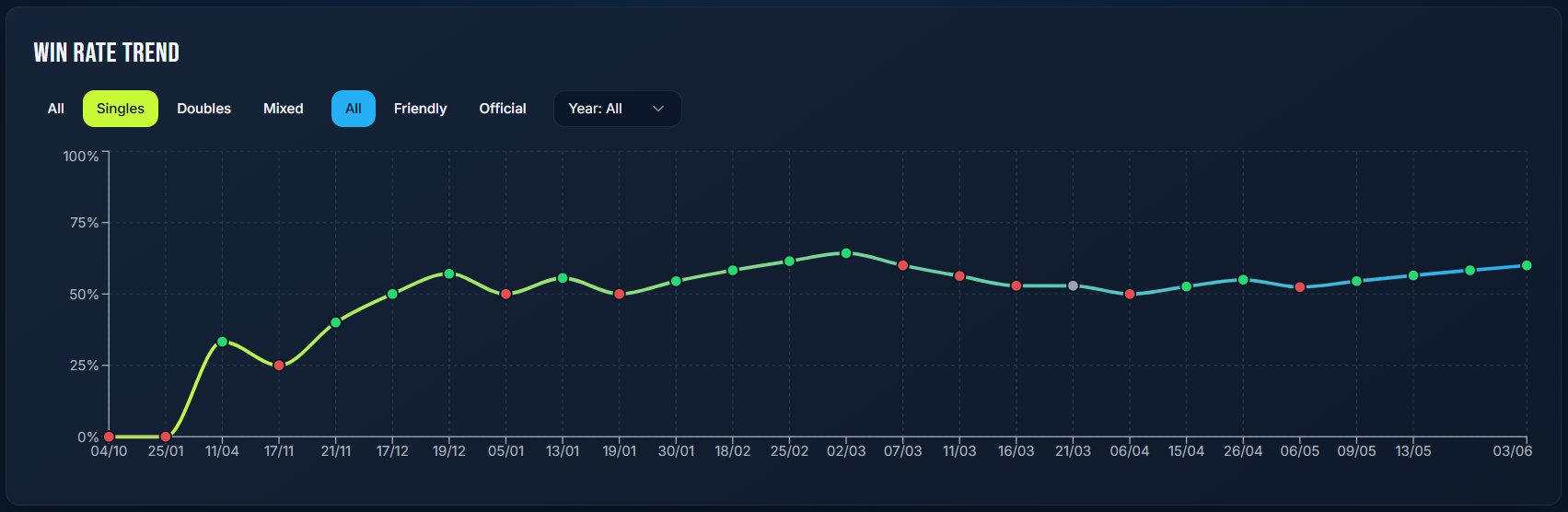
This is one reason the filters around a trend chart matter.
In Tennis Log, the Win Rate Trend view can separate different match contexts such as:
- Singles
- Doubles
- Mixed
- Friendly
- Official
Those are not cosmetic controls.
They allow you to ask narrower questions.
Suppose your overall curve looks stable.
Then you filter to official singles matches and see a different pattern.
That may be much more useful than the combined average.
Or perhaps your overall win rate rises because you have recently played much more doubles, while singles results remain unchanged.
Without filtering, two different stories become one line.
The right filter is not the one that makes the graph look nicest.
It is the one that matches the question you are asking.
6. Singles and doubles should not automatically tell the same story
Singles and doubles are both tennis.
They do not demand exactly the same things.
Your strengths may transfer differently between them.
A player with a strong serve and confident net game may experience a different competitive pattern in doubles from singles.
Another player may perform better when they have more court to build points individually.
Combining both formats can still be useful if your question is simply:
How are my overall match results changing?
But if your question is:
Is my singles game improving?
filter the chart accordingly.
Do not ask a mixed dataset to answer a specific question.
7. Friendly and official matches may deserve separate attention
Some players perform similarly regardless of match type.
Others do not.
Official competition can introduce different:
- opponents,
- incentives,
- routines,
- pressure,
- scoring formats,
- match importance.
Friendly matches can also vary enormously.
Separating them does not prove that psychology caused any difference.
It simply allows you to observe whether a difference exists.
For example:
My friendly results are stable, while official results have gradually improved.
That is a useful observation.
This would be too strong:
I have fixed my competitive nerves.
The chart measured outcomes.
The explanation still needs evidence.
8. A flat line is not necessarily a plateau
Suppose your win rate has remained almost unchanged for months.
It is tempting to conclude:
I am not improving.
But what else changed during those months?
Perhaps you deliberately began playing stronger opponents.
Perhaps you moved into a higher league.
Perhaps matches that used to be comfortable are now being replaced by much more competitive ones.
If your level of opposition rises while your results remain stable, the flat curve may hide meaningful progress.
The opposite is also possible.
Stable win rate against gradually weaker competition would tell a different story.
Win rate has no built-in measure of difficulty.
That is why context matters.
9. An upward line is not automatically skill improvement either
This is the pleasant mistake.
The curve rises.
We would like to believe:
I am better now.
Maybe you are.
But check the alternatives.
Did you:
- play weaker opponents?
- play more matches on your preferred surface?
- play more friendly matches?
- have an unusually favourable run of close results?
- change from singles to doubles?
- begin playing one opponent repeatedly whom you match up well against?
None invalidates the victories.
The wins happened.
The question is what the trend says about your broader game.
A useful interpretation might be:
My results have improved. Now I want to understand whether the improvement survives comparable opposition.
That is stronger than assuming the cause.
10. A falling line is not automatically bad news
Suppose you deliberately start challenging better players.
You lose more.
The trend falls.
But perhaps:
- sets are becoming closer,
- you are creating more break opportunities,
- your service games are more competitive,
- you are executing new patterns successfully,
- you are learning to tolerate a higher level of pace.
The scoreboard does not owe you an immediate reward for improvement.
Sometimes your competitive environment changes faster than your results can show progress.
This is why win rate belongs beside performance indicators, not above them.
11. Look for changes that survive several filters
A pattern becomes more interesting when it does not disappear as soon as you look at it differently.
Suppose your overall win-rate trend rises.
Then:
- singles rises,
- official matches rise,
- results against comparable opponents rise.
Now the improvement story is becoming stronger.
You still cannot identify the cause from win rate alone.
But several views point in the same direction.
Compare that with:
- overall rises,
- singles stays flat,
- official falls,
- friendly doubles rises sharply.
That is not necessarily bad.
It simply tells a more specific story.
Useful analysis often comes from discovering where the trend survives.
12. Do not hunt for the filter that proves what you already believe
Charts make this surprisingly easy.
You think:
I've been playing brilliantly lately.
Overall trend looks flat.
So you try singles.
Still flat.
Hard court.
Slight rise.
Friendly hard-court singles against familiar opponents?
There it is.
Proof!
Not really.
The more ways you divide a small dataset, the easier it becomes to find an attractive pattern by chance.
Use filters because the distinction matters to your tennis.
Not because you are searching for the version of the chart that agrees with you.
13. Very small filtered groups deserve extra caution
Filtering creates relevance.
It also removes data.
Suppose your complete history contains forty matches.
Your clay-only filter contains four.
The clay curve may look dramatic.
That does not mean it is useless.
It means the claim should stay appropriately small:
So far, my clay results have been weaker.
rather than:
Clay is definitely my worst surface.
The more specific your question becomes, the fewer matches may remain to answer it.
Always notice the denominator.
14. Connect the curve to other match statistics
A win-rate trend tells you whether results changed.
Other statistics can help you investigate what changed with them.
Suppose your win rate rises during the same period that:
- service games held improve,
- second-serve outcomes improve,
- return-game results remain stable.
That creates a possible service-related story worth investigating.
Or suppose win rate falls while serve performance remains similar but return games deteriorate.
Now your attention moves elsewhere.
The important word is:
possible.
Correlated changes do not automatically establish cause.
They help you decide where to look.
15. Connect the curve to your notes
Numbers are often strongest when paired with something you observed.
Imagine your win-rate trend improves over eight matches.
Your notes repeatedly say:
More patient in neutral rallies.
>
Fewer early direction changes.
>
Better depth to backhand.
Now you have both:
result evidence
and
behavioural observations.
That still does not prove a single tactical change caused the results.
But it is much more informative than the rising line alone.
This is why even short match notes can become valuable months later.
16. Do not ask the chart whether you are “good”
Win rate is highly dependent on the competition you choose.
A player who consistently plays stronger opponents may have a lower win rate than a similar player who chooses easier matches.
Neither percentage automatically tells you who is better.
The useful comparison is usually:
me now versus me before, under reasonably comparable circumstances.
And even then, win rate should be only part of the evidence.
The graph is a development tool.
Not a tennis ranking.
17. Use the curve to identify periods worth investigating
Sometimes the most useful feature of a trend is not the direction.
It is the location of a change.
Suppose the line is stable for months and then begins moving differently.
Ask:
What happened around here?
Perhaps:
- you changed serve technique,
- began lessons,
- changed competition level,
- returned from a break,
- started playing more often,
- changed racket,
- moved from hard court to clay,
- began recording a different type of match.
Now the graph becomes a timeline for your tennis history.
The change point creates a question.
18. Beware of retrospective storytelling
Once you know what happened, it is easy to create a convincing explanation.
The line started rising in March because I improved my backhand.
But perhaps in March you also:
- changed opponents,
- played more doubles,
- entered fewer official matches,
- changed surface.
Human beings are excellent at building stories after seeing the result.
A better approach is to write down the hypothesis before enough future matches arrive.
For example:
I have changed my second serve. I want to see whether service-game and overall results change over the next group of comparable matches.
Now you have a prediction to test.
That is much stronger than explaining the graph afterwards.
19. Use the trend as a signal to investigate, not a reason to panic
A losing streak can make the chart look ugly very quickly.
That visual can exaggerate the emotional effect of the matches.
Before rebuilding your entire game, ask:
- How many matches are involved?
- Were they close?
- Were opponents stronger?
- Did one part of the game clearly deteriorate?
- Is this actually different from normal variation in my history?
Sometimes action is appropriate.
Sometimes the best decision is simply:
keep collecting evidence.
The graph should improve your judgment.
Not amplify anxiety.
20. A trend needs time
This does not mean you must wait for a specific number of matches.
There is no universal threshold after which a tennis win-rate curve suddenly becomes reliable.
Instead, confidence grows gradually as:
- more matches accumulate,
- similar contexts repeat,
- individual results have less influence,
- patterns survive different comparisons.
Early in your history, read the chart as:
“This is what has happened so far.”
Later, repeated patterns may justify stronger conclusions.
The wording should become more confident only when the evidence does.
A practical way to read your Win Rate Trend
When you open the chart, use this sequence:
1. Describe the curve
Up, down, flat, volatile?
Do not explain it yet.
2. Check how many matches are involved
Could one or two results change the story substantially?
3. Check the opponents
Did competition strength change?
4. Use the relevant filters
Singles? Doubles? Friendly? Official?
Do not mix contexts unnecessarily.
5. Look for supporting statistics
Did serve, return or another metric change at the same time?
6. Read your match notes
What behaviour was actually changing?
7. Form a hypothesis
The results may be improving because \\_\\_\\_\\_\\_\\_\\_\\_.
8. Test it with future matches
Do not promote the hypothesis to fact until more evidence arrives.
That process takes only a few minutes.
And it transforms the chart from decoration into analysis.
The curve is the beginning of the question
A win-rate trend is appealing because it seems to compress months of tennis into one shape.
And it does.
But compression removes information too.
The line does not know:
- who you played,
- how close the sets were,
- whether your level of opposition changed,
- whether your serve improved,
- whether you were experimenting with something new,
- whether four matches came from a completely different context.
That information lives elsewhere.
So use the curve for what it does well.
Let it show you:
results are changing here.
Then ask why.
Filter.
Compare.
Read the notes.
Look at supporting statistics.
Wait for more matches.
The goal is not to decide whether the line is good or bad.
The goal is to understand what story your results can actually support — and what story you are merely tempted to tell yourself.
Further reading
International Tennis Federation — Rules and Regulations For official tennis scoring terminology.
Performance analysis in tennis since 2000: A systematic review focused on methods of data collection For broader context on how tennis performance information is collected and interpreted.